Monetize Forge
As of 2016, Forge has been in Beta service for 2 years. At Autodesk's annual event ‘Forge Devcon’, the team wants to announce official pricing plan so that our clients can commercialize their applications using our services.
I played 3 roles for this project:
Coordinator - as we had to collaborate heavily with another design team in Tel Aviv and the marketing team in US, I played a coordinator role to make sure we came up with a unified experience
Designer - I was in charge of new pages (terms of service pop-up, pricing, my subscription) and revising existing experience (usage dashboard, Cloud credit transaction flow)
Researcher - I had to quickly get feedback on designs and also ran follow up qualitative interviews after release

How to introduce the big change on homepage?
According to research, although Forge service was out for 2 years, still our users are not familiar with our offerings and applications - what they can do about it. Hense, before talking about pricing, we had to well communicate our offerings first.
Using the Core model framework, the marketing team and I came up with a messaging structure. Also involved the engineering team in a workshop to review and share their thoughts.

Core model framework : worked out together with marketing team

Content structuring workshop with developers

Homepage variations

Released homepage
What’s the best way to communicate pricing, and how to connect the existing cloud credit payment flow?
One of the challenges was the ever-changing business model. By nature, it is tricky to determine calls to charge for our service as not all of our services are measurable. We had to switch decisions from pay-per-use to subscription model(s) to the Cloud Credit model. Since the team has already spent 50% of the time on building based on pay per use, we had to work under strong time pressure. The team has decided to use the existing payment flow(Autodesk Cloud Credit), and we had to revise it to better fit our model.
Obviously, the flow couldn’t be perfect. UX challenge was how to rationalize and stitch as much as possible so that it doesn’t break so much.

User flow for subscription

Review BiC flow (Autodesk Cloud Credit Flow)

Simplified version of payment flow

Mobile view of subscription page and scenarios
Communicate how much you use
Earlier we had a usage dashboard, focusing on API usage reporting. As we are announcing a paid plan, we have to introduce a free quota and upgrade path.
Also, the existing UI structure was created with the assumption of limited services, but since we plan to scale up the number of services, we had to change the UI structure as well.
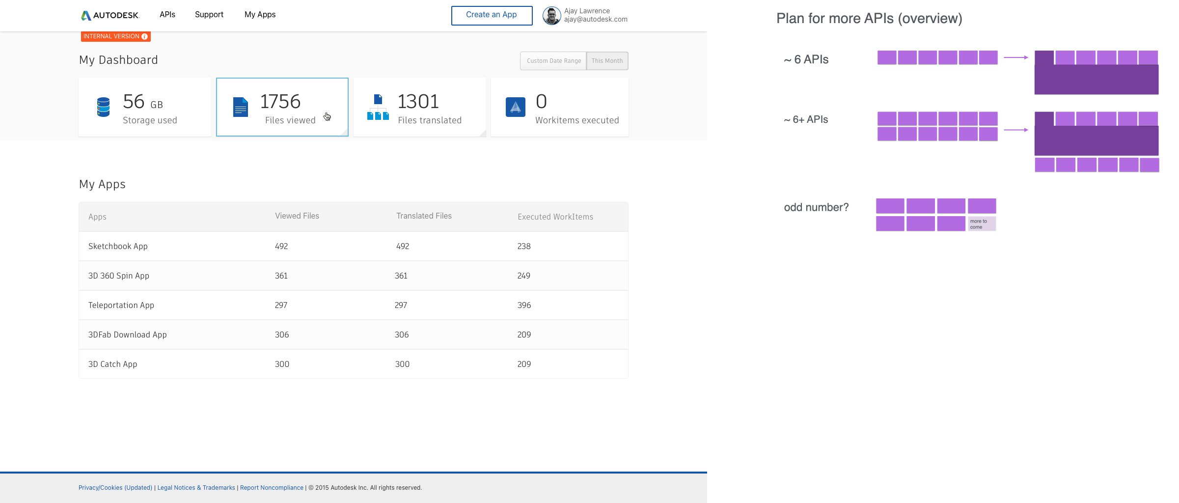
Early usage page and trial to scale the UI

Early variation of usage dashboard

Final usage analytics page design catered for monthly fixed cloud credit
Pinch of delightfulness
As our APIs are not immediately understandable, we tried to apply visuals to better communicate what they do.
Early sketch of Authentication API
Animated icon